Case study · 2024 — present
Driver Advisory System
An in-cab advisory system for rail operators. Two years of research, stakeholder alignment and information architecture translated into a calm interface for a high-stakes environment.
- Role
- UX Architect
- Focus
- ResearchUsability testingWorkshopsStakeholder managementInformation architecture
- Year
- 2024 — present
Overview
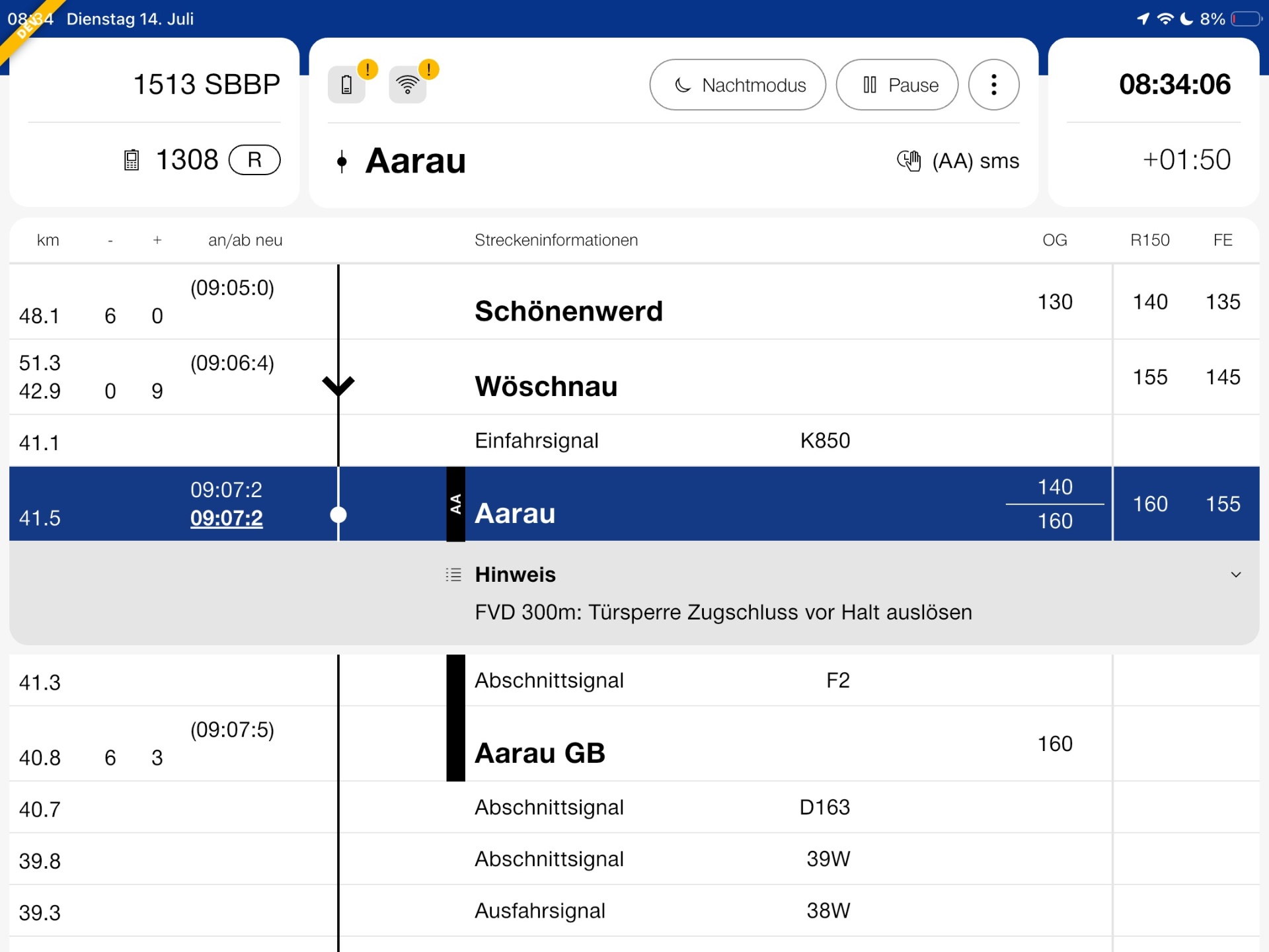
The Driver Advisory System (DAS) is a new tablet app used in the driving cab. Built to unify three separate legacy tools used by SBB (including SBB Cargo), SOB and BLS. Each railway had its own aging system approaching end of life. On the back of an infrastructure-wide data clean-up aligning Swiss railways with the European SFERA standard, the cooperation decided to build a single, internal driving interface for all cooperating companies and their subsidiaries — reducing training cost, easing personnel exchange between operators, and making integrated data usable end to end.
Challenge
The core challenge was merging three deeply held mental models into one interface. What the interface displays is heavily regulated by the BAV (the Swiss Federal Office of Transport), and several functions make the application Sicherheitsrelevant — safety-relevant. Every design decision had to be defensible on regulatory and safety grounds, not just usability.
We were replacing three familiar tools in roughly six months with an average of two hours of formal training per driver. The new tool had to feel continuous enough not to disrupt daily work, while quietly leaving behind years of "DIY" accretions from the legacy systems.
Role & team
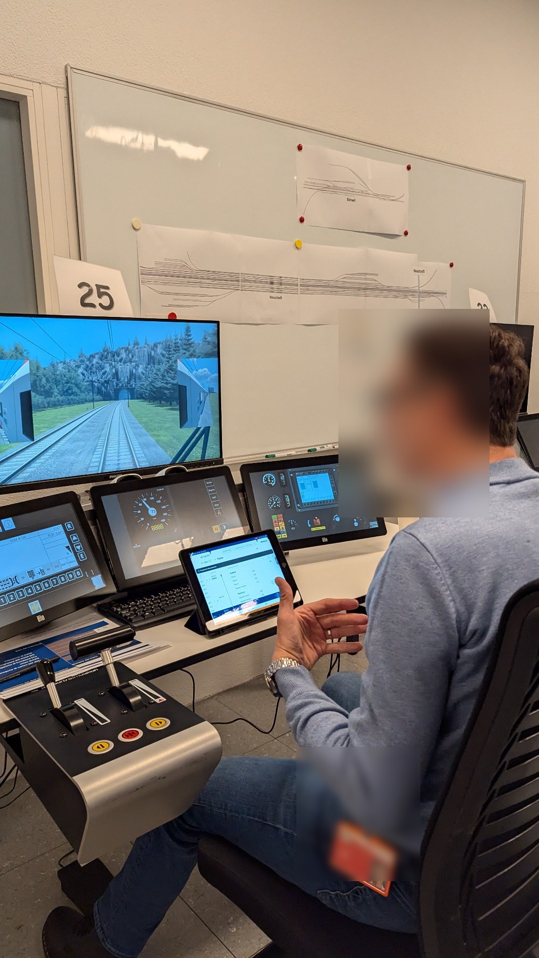
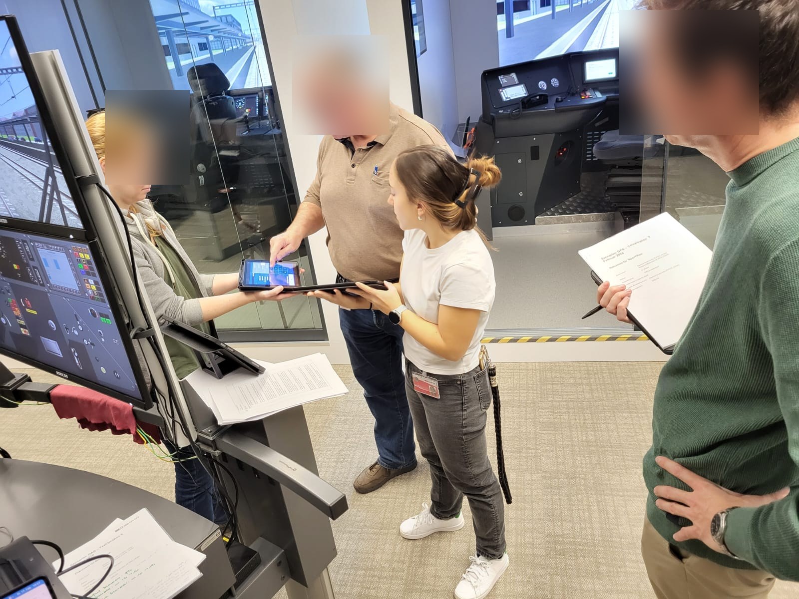
My primary role was research and validation. I coordinated the workshops, ran more than nine iterations of usability testing and two large-scale, modified rounds of "hallway testing" for more quantitative signal, and partnered with the Business Analyst and the UI Designer to shape a UX concept our developers could implement cleanly and coherently against the end goal.
Research & requirements
Requirements collection was done jointly with the BA through workshops, desk research and early tests. The main outputs were over 150 use cases and a catalogue of high-quality user stories handed to development. From day one we worked with high-fidelity prototypes to lock in patterns early, rather than arguing them later on shipped code.
Prioritisation
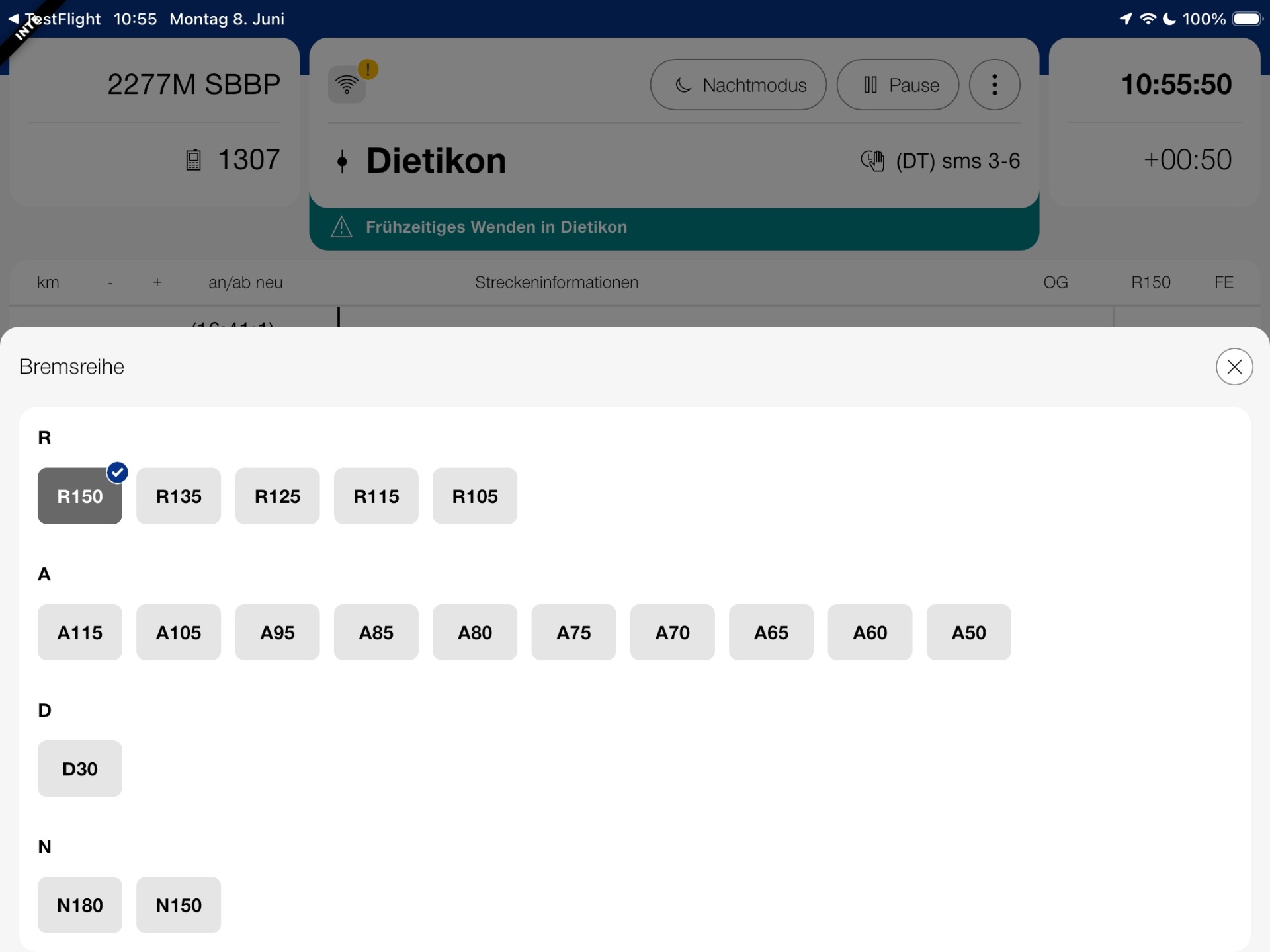
Prioritisation happened with a Fachgruppe — a group of subject-matter experts — splitting requirements into releases. That let us implement and properly test the core functions before layering in secondary features specific to a company or user group (Cargo being the most obvious example).
Design decisions
Three decisions did most of the work:
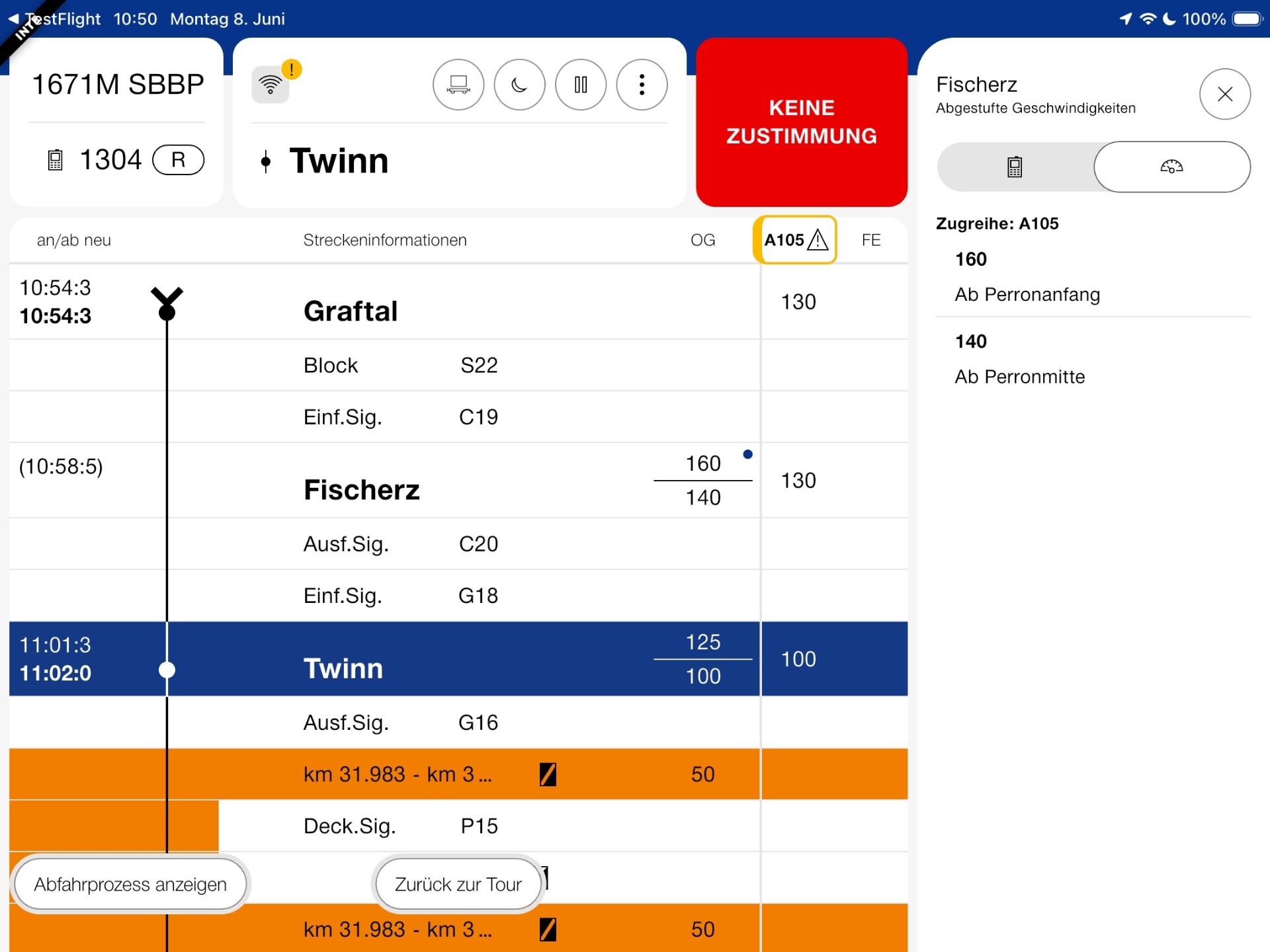
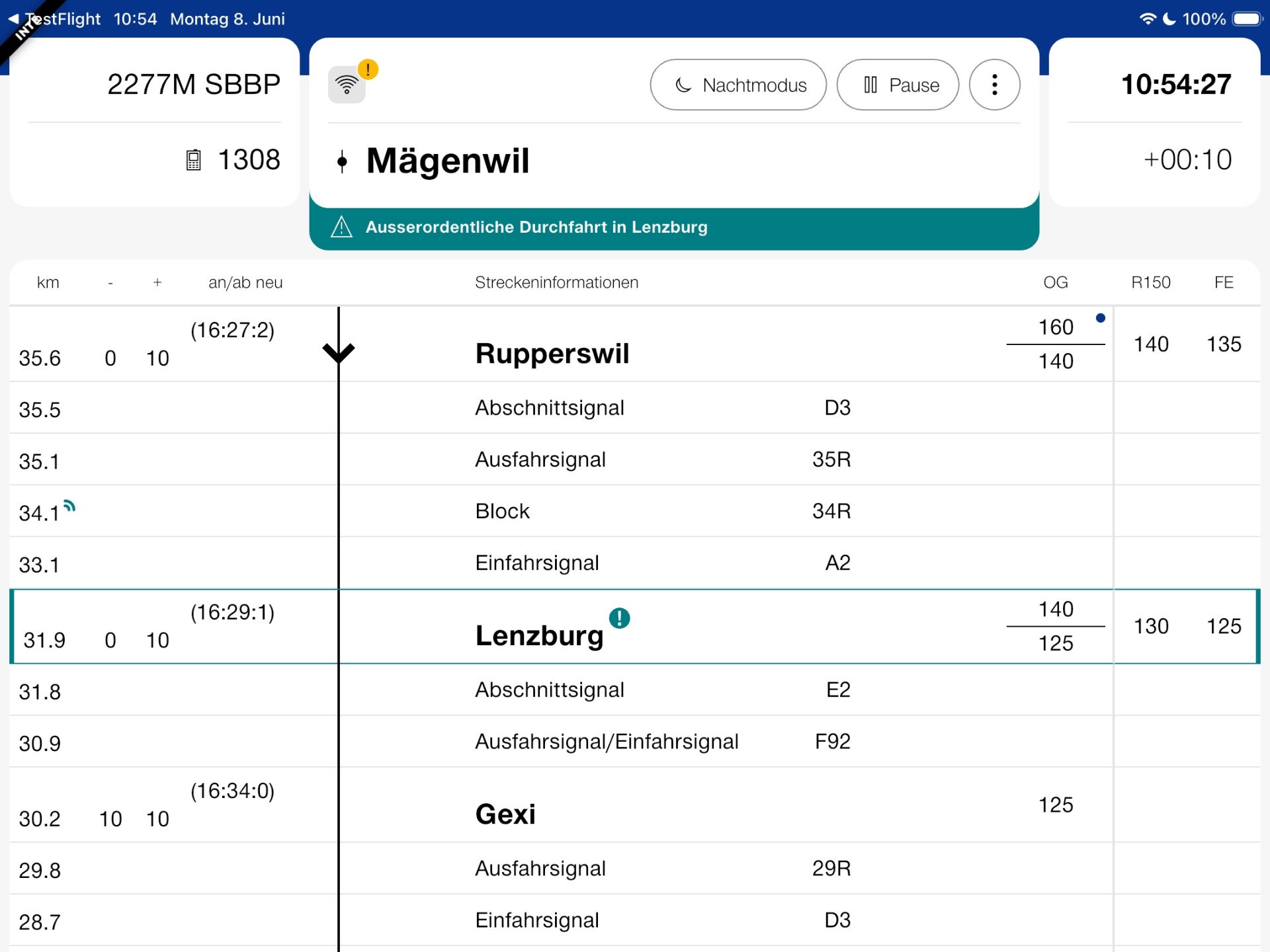
1. Colour becomes a function, not a decoration. We stripped roughly 90% of the colour and moved to an off-brand, strictly functional palette. Every remaining hue earns its place by carrying meaning: red for a lack of authorisation, turquoise for a change against the original plan, orange for a temporary speed restriction, and so on. Information hierarchy is communicated by structure and typography; colour is reserved for state and exceptions the driver must not miss.
2. Table scrolls top-to-bottom. We considered bottom-to-top scrolling (as in a car navigator) and it was arguably more intuitive on paper. In practice, the benefit did not offset the impact on the existing mental model, so we kept top-to-bottom.
3. The header is a cockpit. The upper band became the home for live, position-dependent information; the table below carries the more static route data. The driver sees only what is relevant to their current location at the top, while still being able to anticipate the next three operating points.
Testing & iteration
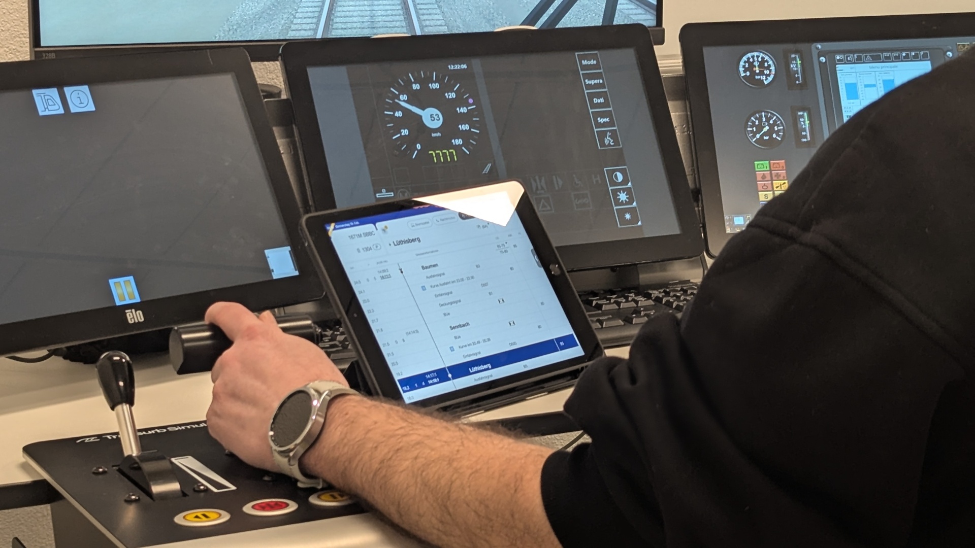
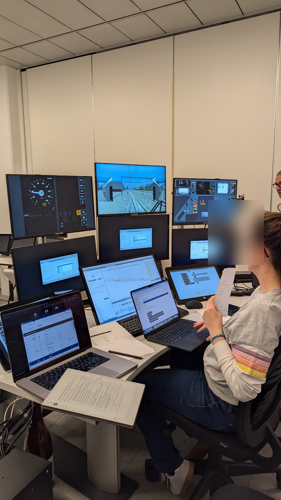
Over two years we ran nine iterations of usability testing — many of them inside the operator's latest-generation driving simulators — plus two large-scale hallway-style rounds for broader quantitative signal. Each cycle folded new functions into the original design, chasing maximum ergonomics and usability without disturbing the underlying paradigm.
Rollout
Version 1 will be frozen in September 2026 for government review. Rollout is scheduled for July 2027, initially in Parallelbetrieb — running alongside the legacy tools — before full cutover. The entire project is open source and available on GitHub.
Lessons learned
This project is where I really understood what politically relevant designing means: managing complex stakeholders, finding compromises without giving up the core concept, and writing down the assumptions behind every component so they can be defended — or explicitly changed — rather than quietly eroded.