Case study · 2023 — 2025
Healthy Busy Life Platform
Reorganising a 20+ product platform across two very different streams — Selfcare and Business — into a website that is simple to navigate and a proper showcase for the whole catalogue. Done with a Brand Designer under my supervision.
- Role
- UX Lead & Product
- Focus
- Information architectureNavigation redesignContent strategyArt directionBrand collaboration
- Year
- 2023 — 2025
Overview
Healthy Busy Life is an Italian personal-growth and small-business platform with over twenty products across two very different streams: Selfcare — nutrition, habits, mindset, personal growth — and Business — support for small businesses and professional transitions. The CEO had a strong instinct for what the ecosystem should feel like; my job was to turn that instinct into a site people could actually navigate.
I reorganised the platform into a website that is simple to move through and, at the same time, a proper showcase for every product in the catalogue — without hiding the complexity that makes the business what it is.
Strategy
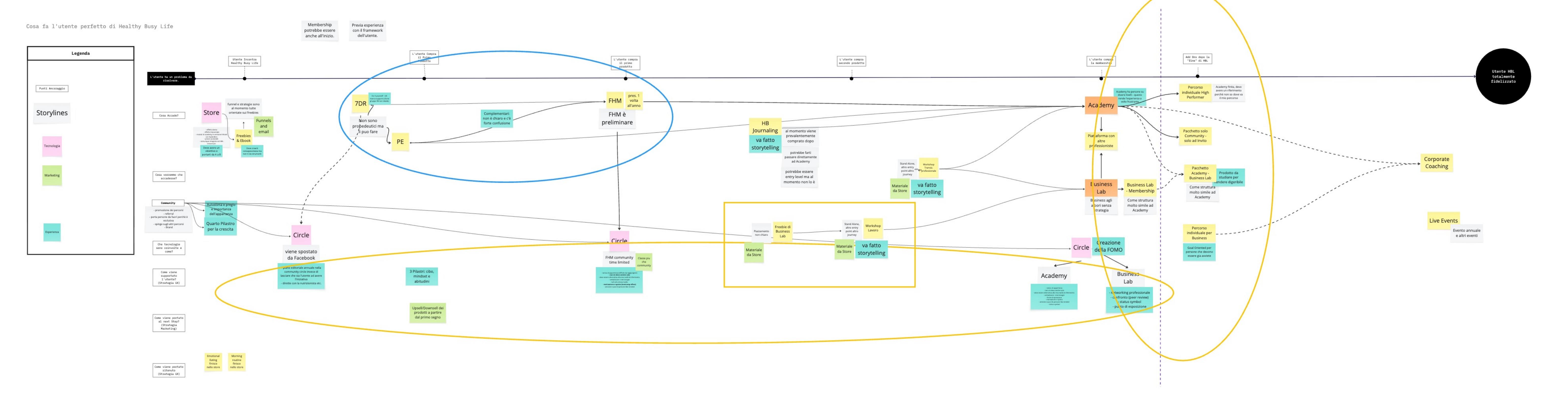
Before touching a screen, we mapped the whole platform: audiences, entry points, product families, cross-links and the emotional register each stream needed. The strategy below is the one-page artefact that kept every later decision honest.
Role & collaboration
The redesign was done together with a Brand Designer who gave us a fresh visual concept, new logos and a consistent frame across the two streams — under my supervision and with continuous product input from my side. Francesca's photography came out of a shoot whose concept — from the outfits to the settings — I planned end to end so the images would carry the same tone as the writing and the structure.
The concept is now in its third year and is still holding up well, even though I left Healthy Busy Life in 2025 and the business has kept growing since.
Navigation & content
The entire structure and navigation was rebuilt so the site is actually browsable. Walls of text were rewritten to deliver useful information first; on top of a light color-coding system, key words are now attached to the product they belong to, so a reader can move from a feeling ("I'm overwhelmed") to a product ("Food, Habits & Mind") without a detour.
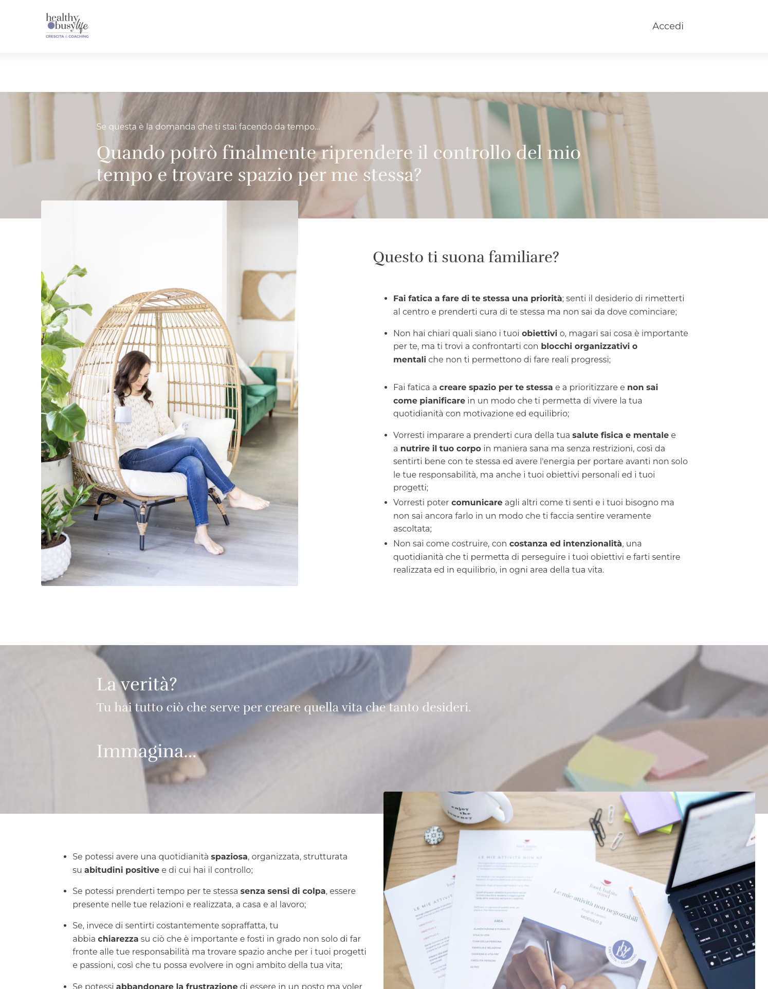
Selfcare — Food, Habits & Mind
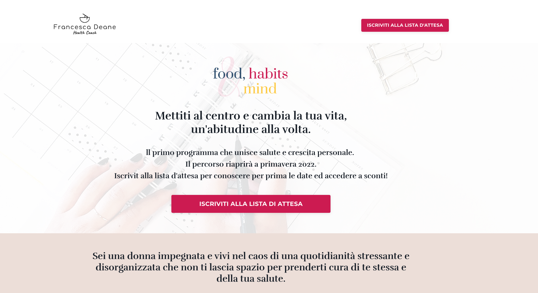
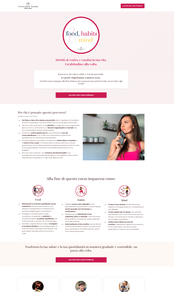
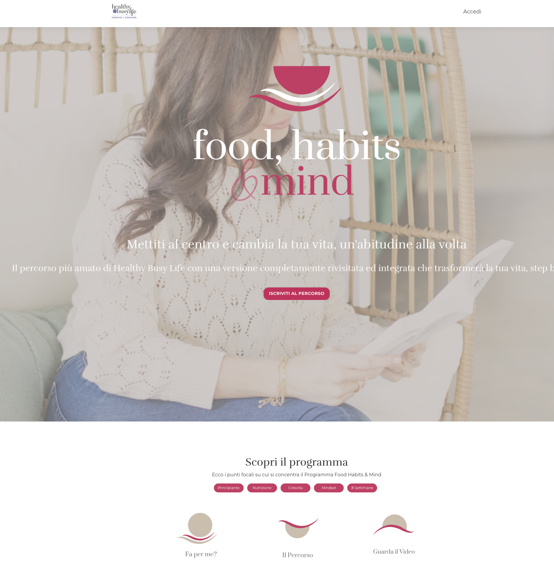
The flagship of the Selfcare stream. Two earlier iterations tried to solve the page with a single message and a waitlist button; the new version carries the person and the promise in the header, then replaces long paragraphs with scannable sections and clear calls to action.
Productivity Evolution
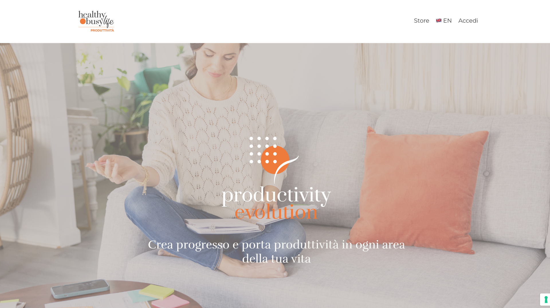
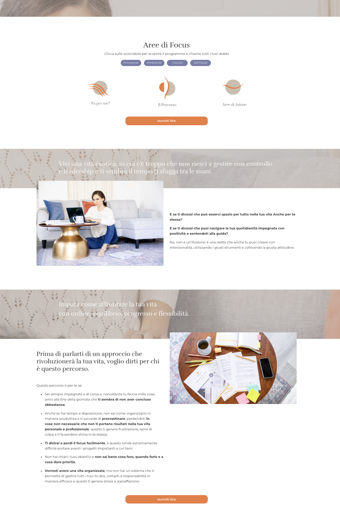
Same treatment, different tone: warmer accent, more action-driven copy, and a header that shows the product name inside the shot rather than sitting on top of it.
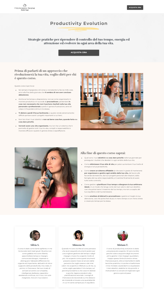
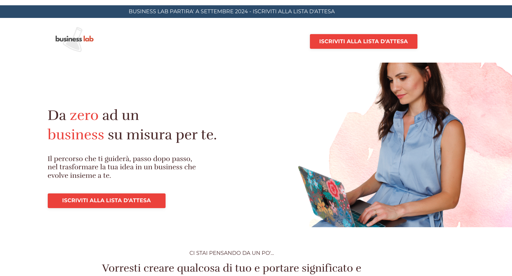
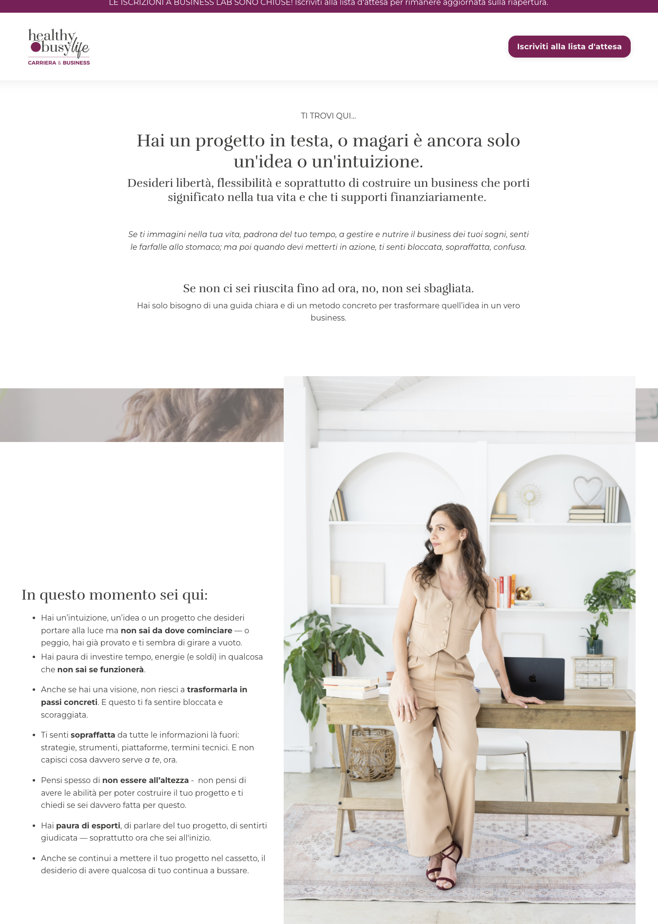
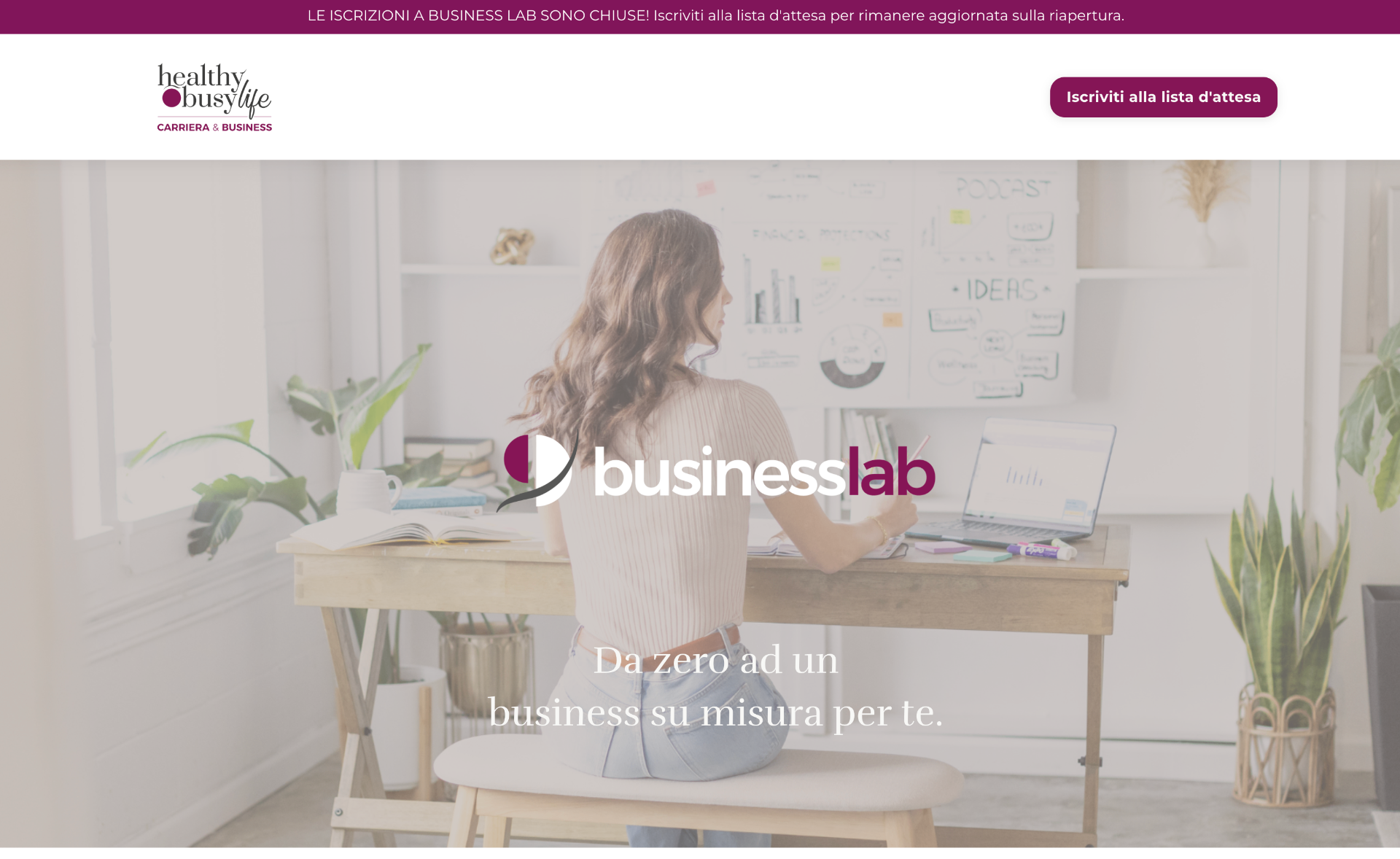
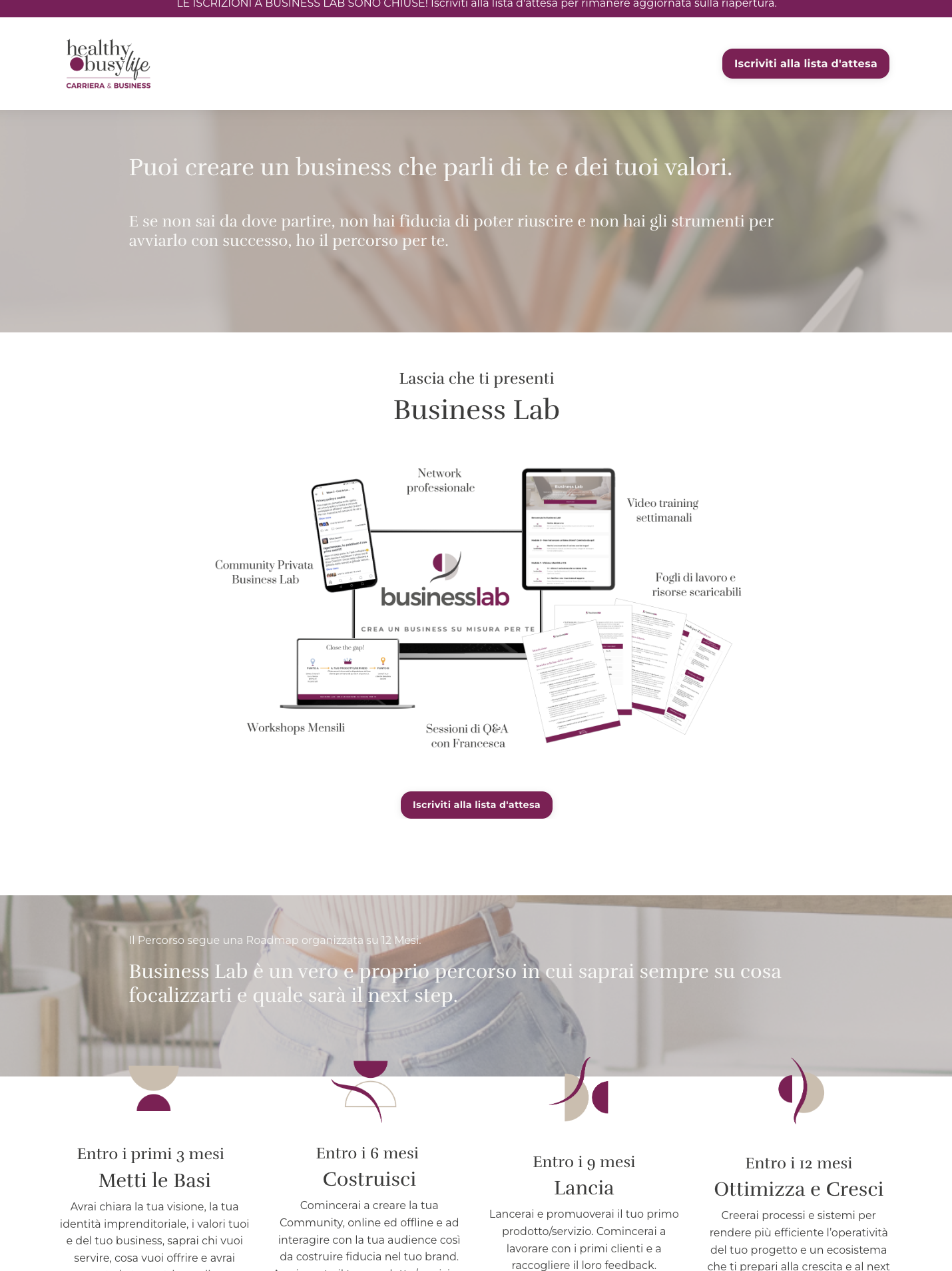
Business — Business Lab
The Business stream needed to feel like a different room in the same house — recognisable, but built for a reader who is already thinking about launching or restructuring something.
Outcome
The new platform is dynamic, browsable and — importantly — fancy without being fussy. The concept stretches: new products fit into the existing frame without a redesign, and the site still reflects the core of the business as it keeps growing. Three years in, and a year after I left, it is still doing its job.
Lessons learned
Twenty products don't need twenty stories — they need one story told at the right altitude. Most of the work was resisting the urge to explain everything, and trusting the structure to do the explaining instead.