Case study · 2026
Website UX Reviews
Two independent website reviews — one for a midwife, one for a physiotherapist — covering first impressions, accessibility, navigation, information architecture, and trust signals. Delivered as browsable, page-by-page documents.
- Role
- UX Reviewer
- Focus
- Heuristic reviewAccessibility (WCAG contrast)Information architectureUX writingDeliverable design
- Year
- 2026
Overview
Two independent website reviews done in 2026 — one for Serena, an independent midwife and MAWIBA® trainer in Zürich, and one for Lorenzo Terranova, a physiotherapist. Both sites were working as digital business cards; the goal in each case was to turn them into clear, trustworthy entry points that guide the right visitor to the right service and hold up on accessibility and mobile.
I used the same method for both: a first-impression test, a visual and accessibility audit, navigation and service-page analysis, a booking / contact flow review, and concrete UX-writing and structure suggestions. Each deliverable is a browsable document — Serena's is 21 pages, Lorenzo's is 32 pages — and both are downloadable as PDFs.
How to read the reviews
Flip through each page in order. Every issue is paired with a "serving suggestion" — a proposed layout, palette adjustment, or copy draft — so the reviews are directly actionable, not just diagnostic.
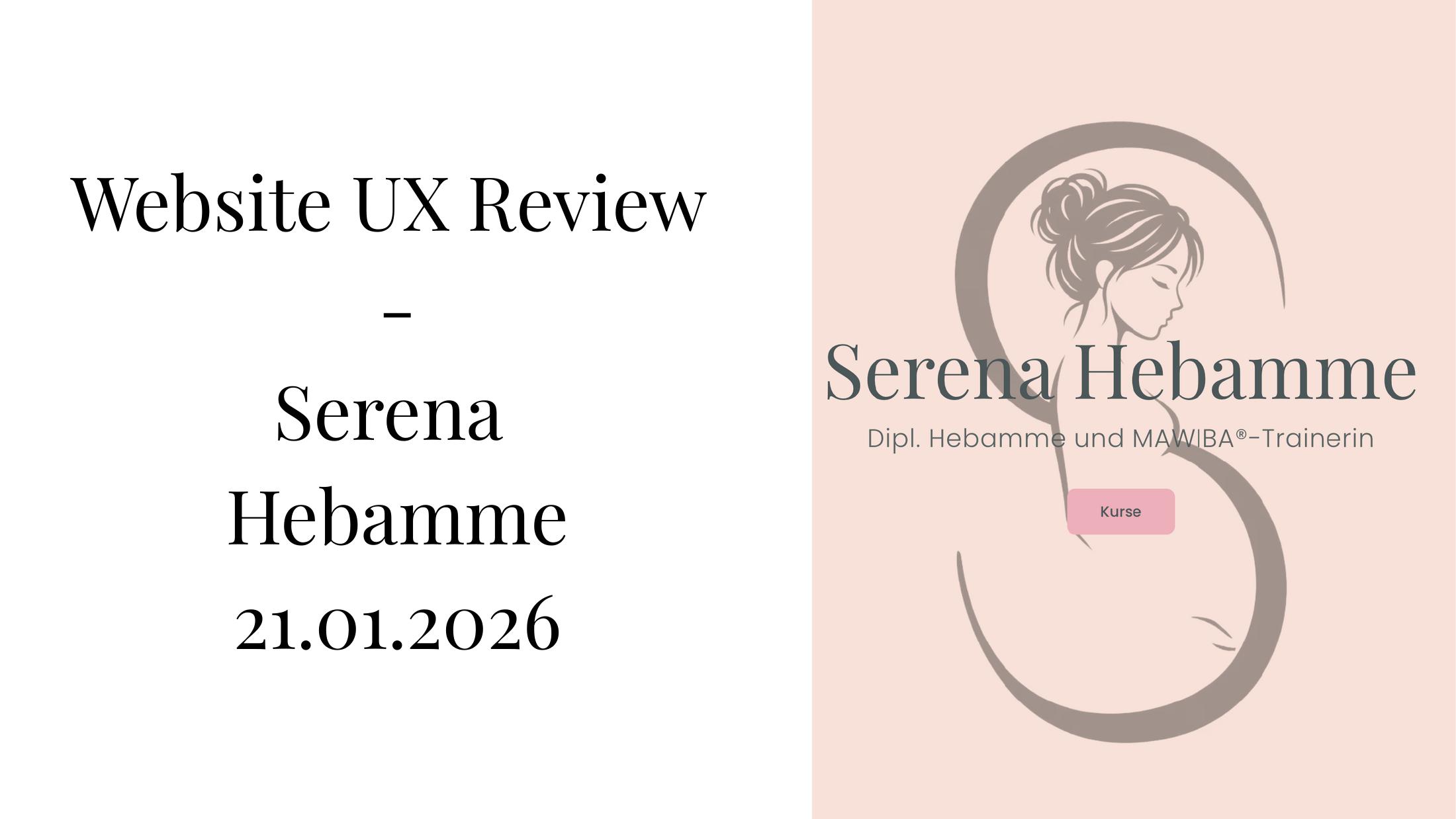
Review 1 — Serena Hebamme
Serena's review focuses on turning a midwife site into something that clearly names the problems she solves, guides visitors to the right class, and passes accessibility checks. Inside: first-impression test, light & dark palette contrast audits against WCAG AA/AAA, an alternative palette proposal, mobile navigation notes, booking-widget usability, and an information-architecture rework for the "About me" and MAWIBA sections with full copy drafts and page outlines.
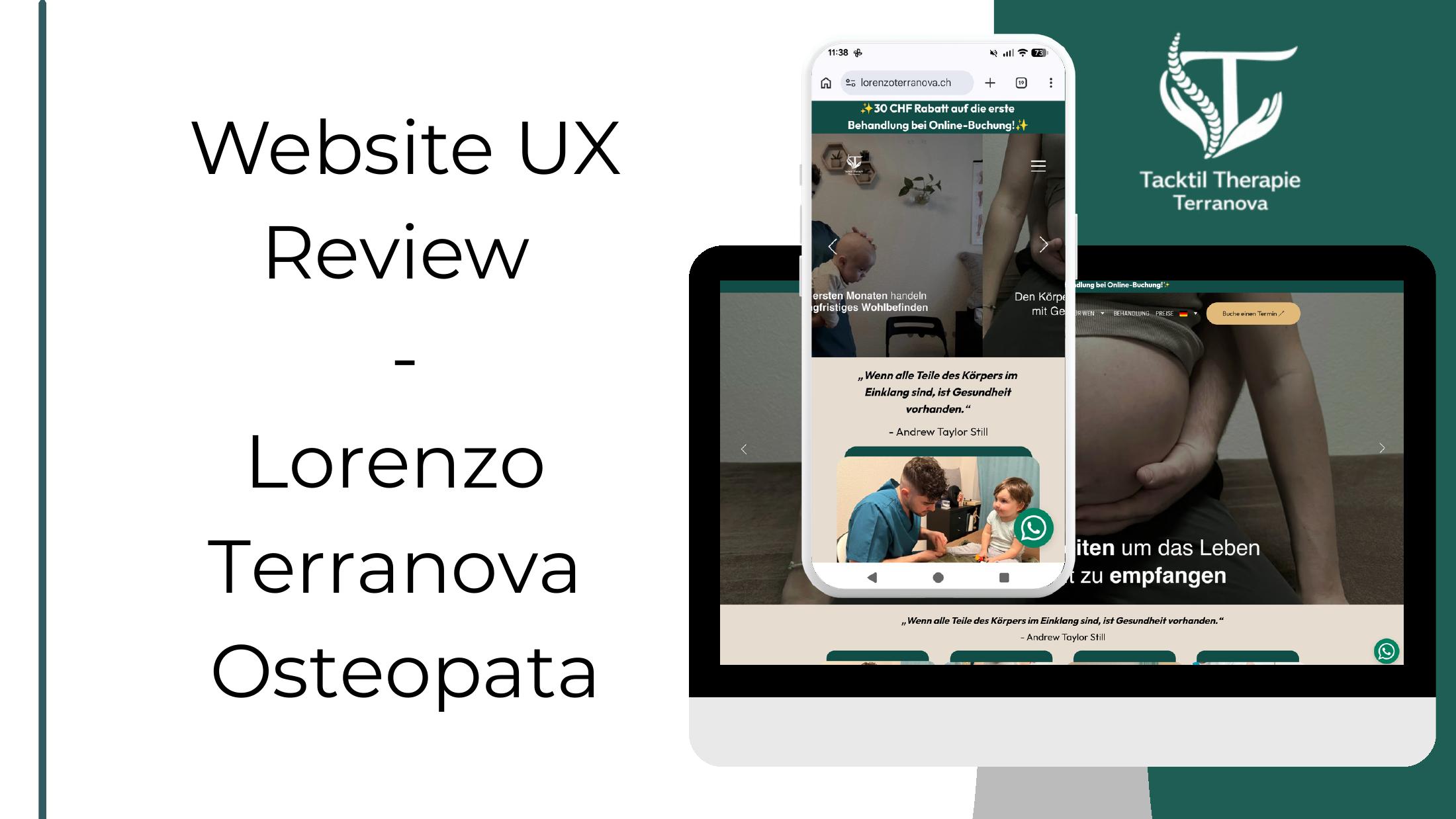
Review 2 — Lorenzo Terranova
Lorenzo's review applies the same method to a physiotherapy practice site: first-impression test, hero clarity, visual and accessibility audit, navigation, service pages, booking / contact flow, trust signals, and copy suggestions.
Outcome
Both clients received a prioritised, actionable document they can hand to a developer or use as a brief for the next iteration of their site. Screen-level issues come with concrete fixes, and the palette work is ready to drop into design tokens.